the controls on the right.
to copy its code.
custom component library.
however you like!
Design system
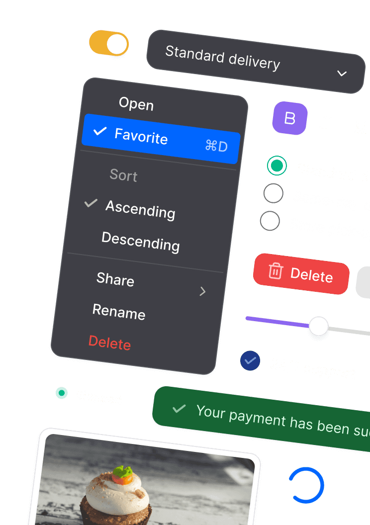
Click any component to copy its code or...
The fastest way to build your ideas
Ship faster.
Use the design controls to make big changes, and optionally modify parts of the code to get the details just right. Webbie is the fastest way to create a component library, while still allowing for flexibility and customization as your project matures.

Customize anything, the code is yours.
Webbie UI is a starter kit, not a package, so there is no lock-in. You can customize every detail, and the code is yours forever.

Accessible to everyone.
All UI components pass WCAG 2.2 accessibility guidelines, color contrast tests and build upon Radix primitives to ensure great accessibility.

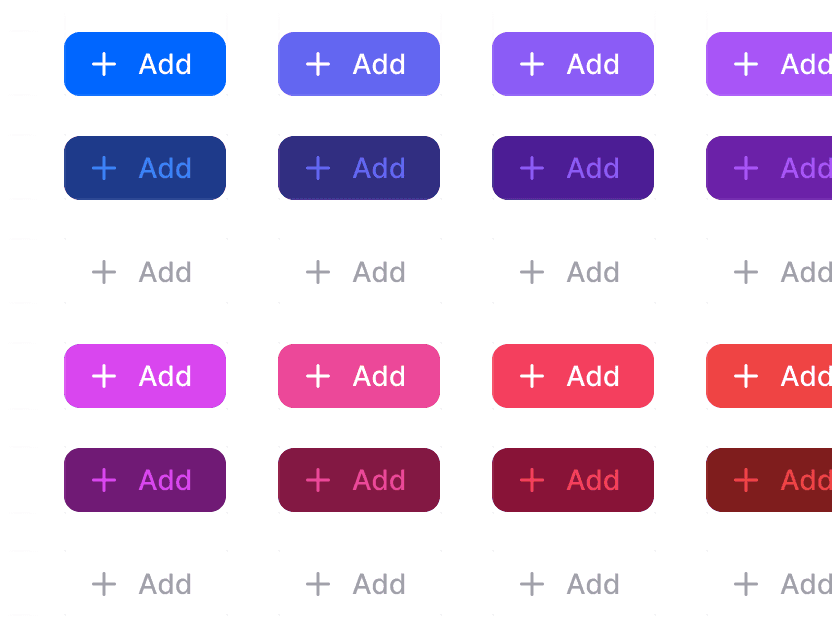
Variants. Responsive. Dark mode.
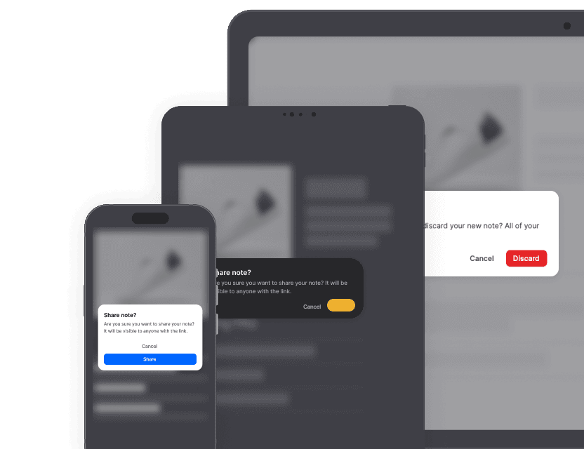
Every component is designed to work across a broad range of devices and contexts, and contains common (editable) variants.

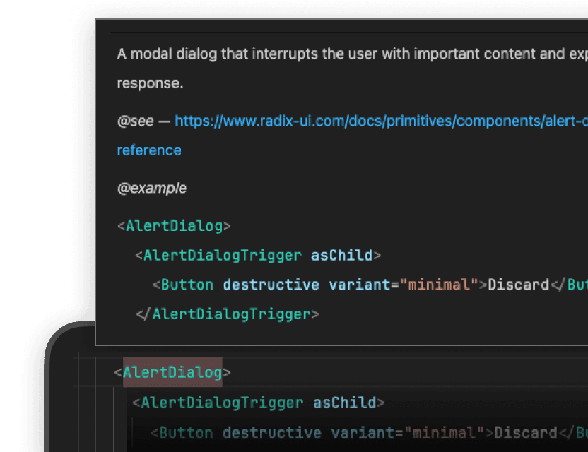
Well-commented with examples.
Every component is commented with JSDoc and includes docs and a usage example, making them easy for new contributors to use.
